Plotting
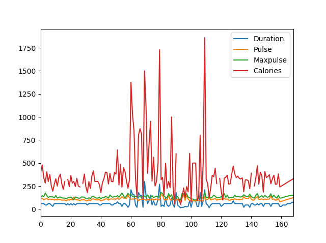
Pandas uses the plot() method to create diagrams.
We can use Pyplot, a submodule of the Matplotlib library to visualize the diagram on the screen.
Read more about Matplotlib in our Matplotlib Tutorial.
Example
  import pandas as pd
import matplotlib.pyplot as plt

df = pd.read_csv('data.csv')

df.plot()

plt.show()
The examples in this page uses a CSV file called: 'data.csv'.
Download data.csv or Open data.csv
Scatter Plot
Specify that you want a scatter plot with the kind argument:
kind = 'scatter'
A scatter plot needs an x- and a y-axis.
In the example below we will use "Duration" for the x-axis and "Calories" for the y-axis.
Include the x and y arguments like this:
x = 'Duration', y = 'Calories'
Example
  import pandas as pd
import matplotlib.pyplot as plt

df = pd.read_csv('data.csv')

df.plot(kind = 'scatter', x = 'Duration', y = 'Calories')

plt.show()
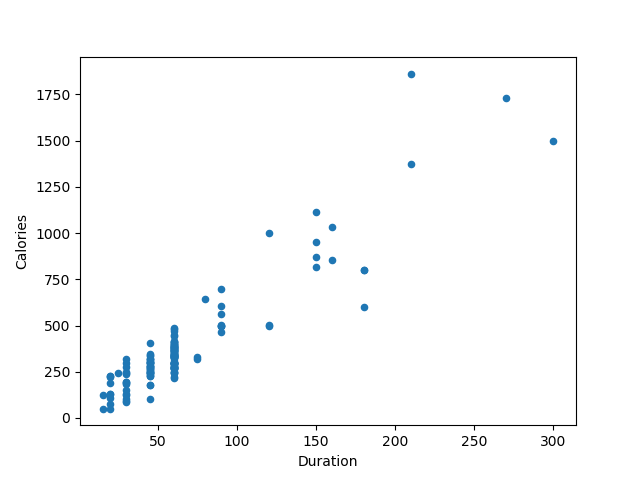
Note: Remember: In the previous example, we learned that the correlation between "Duration" and "Calories" was
0.922721, and we concluded with the fact that higher duration means more calories burned. By looking at the scatterplot, I will agree.
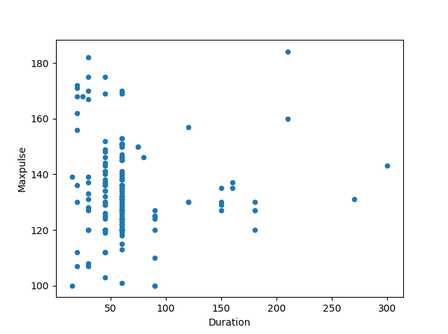
Let's create another scatterplot, where there is a bad relationship between the columns, like "Duration" and "Maxpulse", with the correlation 0.009403:
Example
  import pandas as pd
import matplotlib.pyplot as plt

df = pd.read_csv('data.csv')

df.plot(kind = 'scatter', x = 'Duration', y = 'Maxpulse')

plt.show()
Histogram
Use the kind argument to specify that you want a histogram:
kind = 'hist'
A histogram needs only one column.
A histogram shows us the frequency of each interval, e.g. how many workouts lasted between 50 and 60 minutes?
In the example below we will use the "Duration" column to create the histogram:
Example
df["Duration"].plot(kind = 'hist')
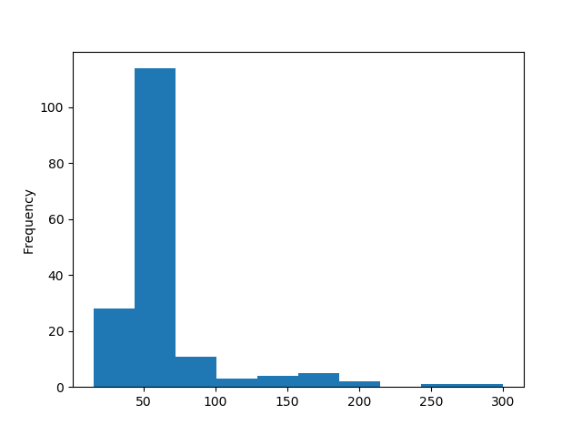
Note: The histogram tells us that there were over 100 workouts that lasted between 50 and 60 minutes.
