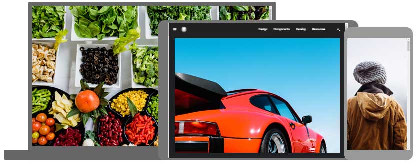
The HTML <picture> element allows you to display different pictures for different devices or screen sizes.
The HTML Element
The HTML <picture> element gives web developers more flexibility in specifying image resources.
The <picture> element contains one or more <source> elements, each referring to different images through the srcset attribute. This way the browser can choose the image that best fits the current view and/or device.
Each <source> element has a media attribute that defines when the image is the most suitable.
Example
  <picture>
  <source media="(min-width: 650px)" srcset="img_food.jpg">

  <source media="(min-width: 465px)" srcset="img_car.jpg">
  <img src="img_girl.jpg">
</picture>
Note: Always specify an
<img>element as the last child element of the<picture>element. The<img>element is used by browsers that do not support the<picture>element, or if none of the<source>tags match.
When to use the Picture Element
There are two main purposes for the <picture> element:
1. Bandwidth
If you have a small screen or device, it is not necessary to load a large image file. The browser will use the first <source> element with matching attribute values, and ignore any of the following elements.
2. Format Support
Some browsers or devices may not support all image formats. By using the <picture> element, you can add images of all formats, and the browser will use the first format it recognizes, and ignore any of the following elements.
Example
  <picture>
  <source srcset="img_avatar.png">

    <source srcset="img_girl.jpg">

    <img src="img_beatles.gif"
  alt="Beatles" style="width:auto;">
</picture>
Note: The browser will use the first
<source>element with matching attribute values, and ignore any following<source>elements.
HTML Image Tags
| Tag | Description |
|---|---|
| Defines an image | |
| Defines an image map | |
| Defines a clickable area inside an image map | |
| Defines a container for multiple image resources |
Note: For a complete list of all available HTML tags, visit our HTML Tag Reference.
