CSS 3D Transforms
The CSS transform property applies a 2D or 3D transformation to an element. This property allows you to rotate, scale, move, and skew elements.
Mouse over the elements below to see the difference between a 2D and a 3D transformation:
CSS 3D Transforms Functions
With the CSS transform property you can use the following 3D transformation functions:
rotateX()rotateY()rotateZ()
The CSS rotateX() Function
The rotateX() function rotates an element around its X-axis at a given degree:
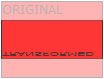
Example
  #myDiv
{

transform: rotateX(150deg);

}
The CSS rotateY() Function
The rotateY() function rotates an element around its Y-axis at a given degree:
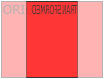
Example
  #myDiv
{

transform: rotateY(150deg);

}
The CSS rotateZ() Function
The rotateZ() function rotates an element around its Z-axis at a given degree:
Example
  #myDiv
{

transform: rotateZ(90deg);

}
CSS Transform Properties
The following table lists all the 3D transform properties:
| Property | Description |
|---|---|
| transform | Applies a 2D or 3D transformation to an element |
| transform-origin | Allows you to change the position on transformed elements |
| transform-style | Specifies how nested elements are rendered in 3D space |
| perspective | Specifies the perspective on how 3D elements are viewed |
| perspective-origin | Specifies the bottom position of 3D elements |
| backface-visibility | Defines whether or not an element should be visible when not facing the screen |
CSS 3D Transform Functions
| Function | Description |
|---|---|
| matrix3d() | Defines a 3D transformation, using a 4x4 matrix of 16 values |
| translate3d() | Defines a 3D translation |
| translateZ() | Defines a 3D translation, using only the value for the Z-axis |
| scale3d() | Defines a 3D scale transformation |
| scaleZ() | Defines a 3D scale transformation by giving a value for the Z-axis |
| rotate3d() | Defines a 3D rotation |
| rotateX() | Defines a 3D rotation along the X-axis |
| rotateY() | Defines a 3D rotation along the Y-axis |
| rotateZ() | Defines a 3D rotation along the Z-axis |
| perspective() | Defines a perspective view for a 3D transformed element |
