CSS Media Queries Examples
Media queries are a popular technique for delivering a tailored style sheet to different devices.
To demonstrate a simple example, we can change the background color for different devices:
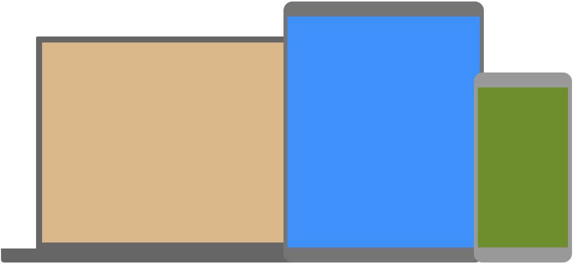
Example
  /* Base style for mobile devices */
body {
  background-color:
  olive;
  color: white;
}

/* For devices with a minimum width
  of 768px (Medium) */
@media screen and (min-width: 768px) {
  body
  {
    background-color: blue;
    color:
  white;
  }
}

/* For devices with a minimum width of 992px
  (Large) */
@media screen and (min-width: 992px) {
  body {

  background-color: tan;
    color: black;
  }
}
Media Queries For Columns
A common use of media queries, is to create a flexible layout. In this example, we create a layout that varies between four, two and full-width columns, depending on different screen sizes:
Example
  * {
box-sizing: border-box;
}

/* Container for flexboxes */
.container {
  display: flex;

  flex-wrap: wrap;
}

/* Create four equal columns */
.column {
  flex: 25%;

  padding: 20px;
}

/* On screens that are 992px wide or less, go from
  four columns to two columns */
@media screen and (max-width: 992px) {

  .column {
    flex: 50%;
  }
}

/* On screens that are 600px wide or less, make
  the columns stack on top of each other instead of next to each other */

  @media screen and (max-width: 600px) {
  .container {

  flex-direction: column;
  }
}
Note: To learn more about the Flexible Box Layout Module, read our CSS Flexbox chapter. To learn more about Responsive Web Design, read our Responsive Web Design Tutorial.
Media Queries For Menus
Here, we use media queries to create a responsive navigation menu, that varies in design on different screen sizes.
Example
   ul {
  list-style-type: none;
  margin: 0;
  padding:
   0;
  background-color: #333333;
  display: flex;
}

   ul li a {
  display: block;
  color: white;

   padding: 14px 16px;
  text-decoration: none;
}

ul li
   a:hover {
  background-color: #111111;
}

/* For viewport
   width 600px or less, make the menu links stack on top of each other */

   @media screen and (max-width: 600px) {
  ul {flex-direction: column;}

   }
Hide Elements With Media Queries
Here, we use media queries to hide an element on small screens:
Example
  /* Hide element if the viewport width is 600px or less */
@media
  screen and (max-width: 600px) {
  #div1 {

  display: none;
  }
}
Change Font Size With Media Queries
Here, we use media queries to change the font size of an element on different viewport widths:
Example
  /* If viewport width is 600px or more, set font-size to 80px */
@media screen and (min-width:
  600px) {
  #div1 {

  font-size: 80px;
  }
}
Media Queries for Screen Orientation
Media queries can also be used to change the layout of a page depending on the orientation of the screen.
Here, we change the background-color of the body, if the screen orientation is in landscape mode:
Example
@media only screen and (orientation:
landscape) {
  body {

    background-color: lightblue;
  }
}
Media Queries for User Preferences
Some users have motion sensitivity and prefer websites with less animation.
The prefers-reduced-motion media feature lets you check if a user has asked to reduce motion, such as animations or transitions. Use this feature to turn off animations and transitions for the users who has activated this setting on their computer:
Example
@media (prefers-reduced-motion: reduce) {

  * {

    animation: none !important;

    transition: none !important;

  }
}
Responsive Image Gallery
Here, we use media queries together with flexbox to create a responsive image gallery:
Example
<div>
</div>
Responsive Website
Here, we use media queries together with flexbox to create a responsive website:
Example
<div>
</div>
CSS Responsive Web Design
To learn more about responsive web design, read our Responsive Web Design Tutorial.
