CSS Grid Gaps
The space between the rows and columns in a grid container are called gaps (or gutters).
The gaps are created between the grid rows and columns, not on the outer edges of the grid container.
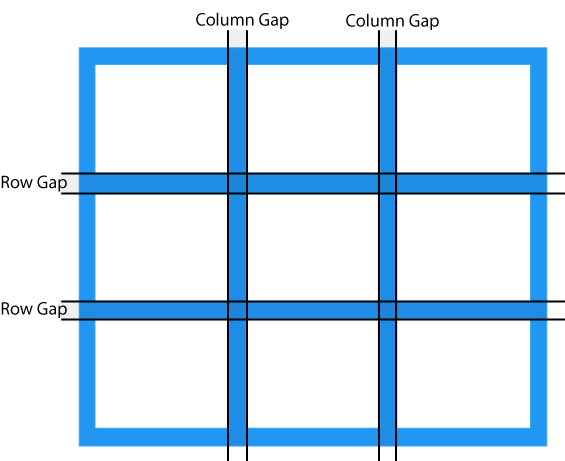
The default size of the gap is 0, which means that there are no spacing between grid items.
The size of the gap can be adjusted with the following properties:
column-gap- Specifies the gap between grid columnsrow-gap- Specifies the gap between grid rowsgap- Shorthand property forrow-gapandcolumn-gap
The CSS column-gap Property
The column-gap property specifies the gap between the columns in a grid.
Example
.container {

  display: grid;
  column-gap: 50px;
}
The CSS row-gap Property
The row-gap property specifies the gap between the rows in a grid.
Example
  .container {

  display: grid;
  row-gap: 50px;
}
The CSS gap Property
The gap property is a shorthand property for row-gap and column-gap.
If a single value is provided, it applies the same gap to both rows and columns.
If two values are provided, the first value sets the row-gap, and the second value sets the column-gap.
Example
  .container {

  display: grid;
  gap: 50px;
}
Example
  .container {

  display: grid;
  gap: 30px 100px;
}
CSS Grid Gap Properties
| Property | Description |
|---|---|
| column-gap | Specifies the gap between the grid columns |
| gap | A shorthand property for row-gap and column-gap |
| row-gap | Specifies the gap between the grid rows |
