Create Labels for a Plot
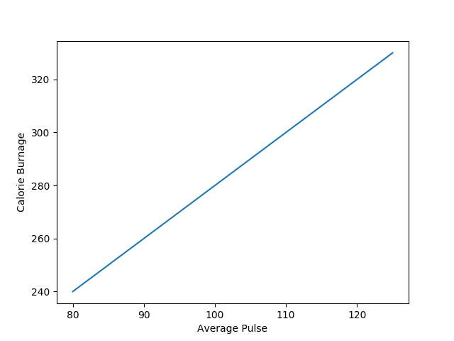
With Pyplot, you can use the xlabel() and ylabel() functions to set a label for the x- and y-axis.
Example
import numpy as np
import matplotlib.pyplot as plt

x = np.array([80,
  85, 90, 95, 100, 105, 110, 115, 120, 125])
y = np.array([240, 250, 260,
  270, 280, 290, 300, 310, 320, 330])

plt.plot(x, y)

plt.xlabel("Average
  Pulse")
plt.ylabel("Calorie Burnage")

plt.show()
Create a Title for a Plot
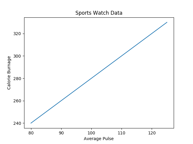
With Pyplot, you can use the title() function to set a title for the plot.
Example
import numpy as np
import matplotlib.pyplot as plt

x = np.array([80,
  85, 90, 95, 100, 105, 110, 115, 120, 125])
y = np.array([240, 250, 260,
  270, 280, 290, 300, 310, 320, 330])

plt.plot(x, y)

plt.title("Sports Watch Data")
plt.xlabel("Average
  Pulse")
plt.ylabel("Calorie Burnage")

plt.show()
Set Font Properties for Title and Labels
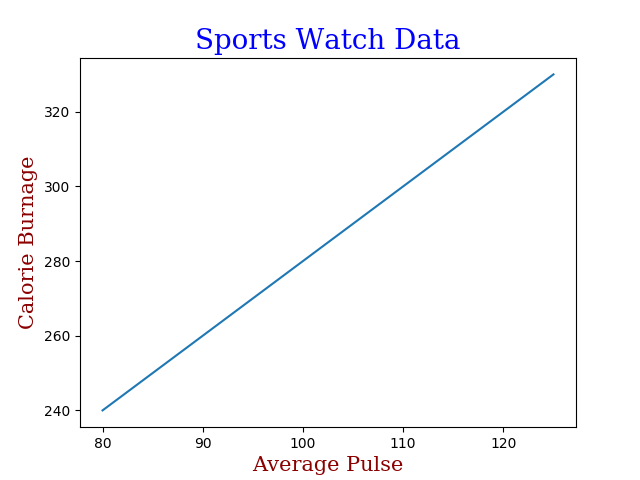
You can use the fontdict parameter in xlabel(), ylabel(), and title() to set font properties for the title and labels.
Example
import numpy as np
import matplotlib.pyplot as plt

x = np.array([80,
  85, 90, 95, 100, 105, 110, 115, 120, 125])
y = np.array([240, 250, 260,
  270, 280, 290, 300, 310, 320, 330])

font1 = {'family':'serif','color':'blue','size':20}
  font2 = {'family':'serif','color':'darkred','size':15}

plt.title("Sports
  Watch Data", fontdict = font1)
plt.xlabel("Average Pulse", fontdict =
  font2)
plt.ylabel("Calorie Burnage", fontdict = font2)

plt.plot(x,
  y)
plt.show()
Position the Title
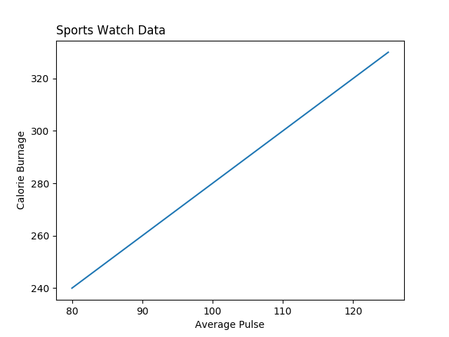
You can use the loc parameter in title() to position the title.
Legal values are: 'left', 'right', and 'center'. Default value is 'center'.
Example
import numpy as np
import matplotlib.pyplot as plt

x = np.array([80,
  85, 90, 95, 100, 105, 110, 115, 120, 125])
y = np.array([240, 250, 260,
  270, 280, 290, 300, 310, 320, 330])

plt.title("Sports Watch Data", loc = 'left')
plt.xlabel("Average
  Pulse")
plt.ylabel("Calorie Burnage")

plt.plot(x,
  y)
plt.show()