
Scatter Plot
A scatter plot is a diagram where each value in the data set is represented by a dot.
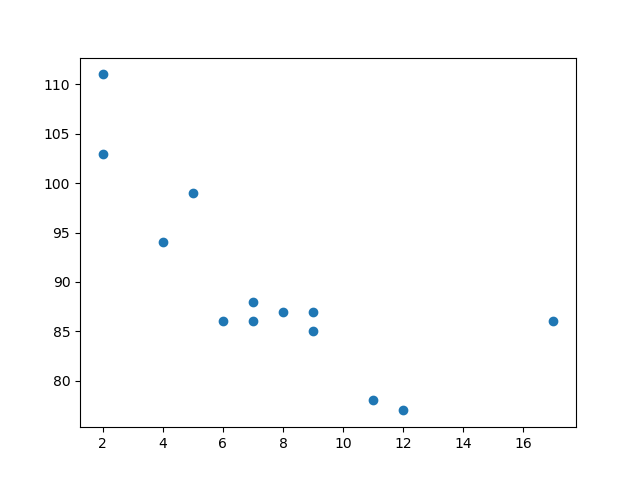
The Matplotlib module has a method for drawing scatter plots, it needs two arrays of the same length, one for the values of the x-axis, and one for the values of the y-axis:
<p><code class="pythonHigh">x = [5,7,8,7,2,17,2,9,4,11,12,9,6]</code></p>
<p><code class="pythonHigh">y = [99,86,87,88,111,86,103,87,94,78,77,85,86]</code></p>
The x array represents the age of each car.
The y array represents the speed of each car.
Example
  import matplotlib.pyplot as plt

x =
  [5,7,8,7,2,17,2,9,4,11,12,9,6]
y =
  [99,86,87,88,111,86,103,87,94,78,77,85,86]

plt.scatter(x, y)
  plt.show()
Scatter Plot Explained
The x-axis represents ages, and the y-axis represents speeds.
What we can read from the diagram is that the two fastest cars were both 2 years old, and the slowest car was 12 years old.
Note: It seems that the newer the car, the faster it drives, but that could be a coincidence, after all we only registered 13 cars.
Random Data Distributions
In Machine Learning the data sets can contain thousands-, or even millions, of values.
You might not have real world data when you are testing an algorithm, you might have to use randomly generated values.
As we have learned in the previous chapter, the NumPy module can help us with that!
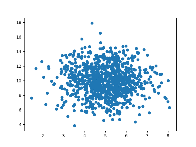
Let us create two arrays that are both filled with 1000 random numbers from a normal data distribution.
The first array will have the mean set to 5.0 with a standard deviation of 1.0.
The second array will have the mean set to 10.0 with a standard deviation of 2.0:
Example
  import numpy
import matplotlib.pyplot as plt

x = numpy.random.normal(5.0,
  1.0, 1000)
y = numpy.random.normal(10.0, 2.0, 1000)

plt.scatter(x, y)
  plt.show()
Scatter Plot Explained
We can see that the dots are concentrated around the value 5 on the x-axis, and 10 on the y-axis.
We can also see that the spread is wider on the y-axis than on the x-axis.
