Creating Scatter Plots
With Pyplot, you can use the scatter() function to draw a scatter plot.
The scatter() function plots one dot for each observation. It needs two arrays of the same length, one for the values of the x-axis, and one for values on the y-axis:
Example
  import matplotlib.pyplot as plt
import numpy as np

x = np.array([5,7,8,7,2,17,2,9,4,11,12,9,6])
y = np.array([99,86,87,88,111,86,103,87,94,78,77,85,86])

plt.scatter(x, y)
plt.show()
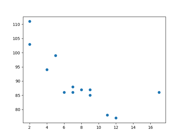
The observation in the example above is the result of 13 cars passing by.
The X-axis shows how old the car is.
The Y-axis shows the speed of the car when it passes.
Are there any relationships between the observations?
It seems that the newer the car, the faster it drives, but that could be a coincidence, after all we only registered 13 cars.
Compare Plots
In the example above, there seems to be a relationship between speed and age, but what if we plot the observations from another day as well? Will the scatter plot tell us something else?
Example
  import matplotlib.pyplot as plt
import numpy as np

#day one, the age
  and speed of 13 cars:
x = np.array([5,7,8,7,2,17,2,9,4,11,12,9,6])
  y = np.array([99,86,87,88,111,86,103,87,94,78,77,85,86])
plt.scatter(x,
  y)

#day two, the age and speed of 15 cars:
x = np.array([2,2,8,1,15,8,12,9,7,3,11,4,7,14,12])
y = np.array([100,105,84,105,90,99,90,95,94,100,79,112,91,80,85])
  plt.scatter(x, y)

plt.show()
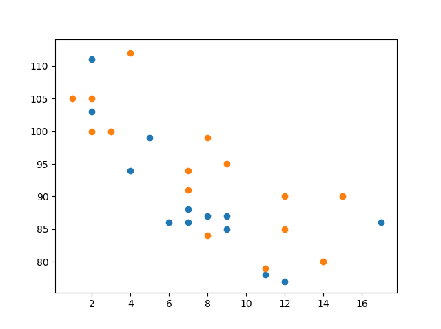
Note: The two plots are plotted with two different colors, by default blue and orange, you will learn how to change colors later in this chapter.
By comparing the two plots, I think it is safe to say that they both gives us the same conclusion: the newer the car, the faster it drives.
Colors
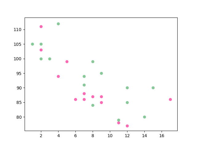
You can set your own color for each scatter plot with the color or the c argument:
Example
  import matplotlib.pyplot as plt
import numpy as np

x = np.array([5,7,8,7,2,17,2,9,4,11,12,9,6])
  y = np.array([99,86,87,88,111,86,103,87,94,78,77,85,86])
plt.scatter(x,
  y, color = 'hotpink')

x = np.array([2,2,8,1,15,8,12,9,7,3,11,4,7,14,12])
y = np.array([100,105,84,105,90,99,90,95,94,100,79,112,91,80,85])
  plt.scatter(x, y, color = '#88c999')

plt.show()
Color Each Dot
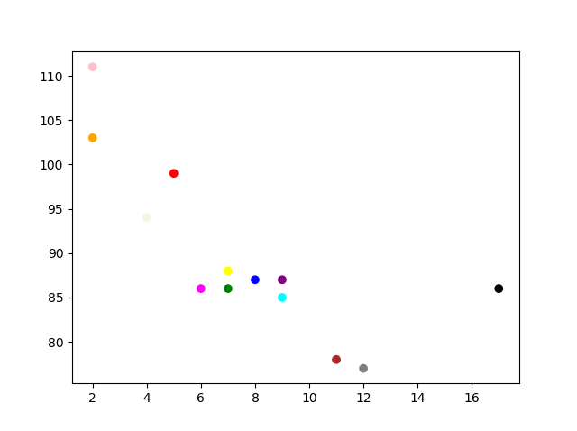
You can even set a specific color for each dot by using an array of colors as value for the c argument:
Note: You cannot use the
colorargument for this, only thecargument.
Example
  import matplotlib.pyplot as plt
import numpy as np

x = np.array([5,7,8,7,2,17,2,9,4,11,12,9,6])
  y = np.array([99,86,87,88,111,86,103,87,94,78,77,85,86])
colors = np.array(["red","green","blue","yellow","pink","black","orange","purple","beige","brown","gray","cyan","magenta"])

plt.scatter(x, y, c=colors)

plt.show()
ColorMap
The Matplotlib module has a number of available colormaps.
A colormap is like a list of colors, where each color has a value that ranges from 0 to 100.
Here is an example of a colormap:

This colormap is called 'viridis' and as you can see it ranges from 0, which is a purple color, up to 100, which is a yellow color.
How to Use the ColorMap
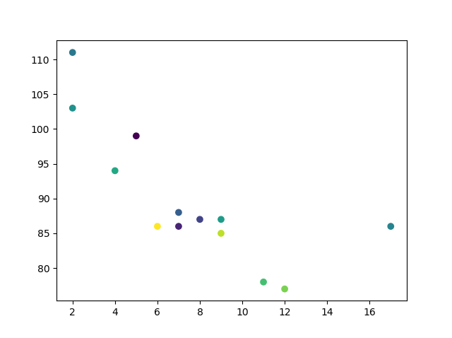
You can specify the colormap with the keyword argument cmap with the value of the colormap, in this case 'viridis' which is one of the built-in colormaps available in Matplotlib.
In addition you have to create an array with values (from 0 to 100), one value for each point in the scatter plot:
Example
  import matplotlib.pyplot as plt
import numpy as np

x = np.array([5,7,8,7,2,17,2,9,4,11,12,9,6])
  y = np.array([99,86,87,88,111,86,103,87,94,78,77,85,86])
colors = np.array([0,
  10, 20, 30, 40, 45, 50, 55, 60, 70, 80, 90, 100])

plt.scatter(x, y, c=colors, cmap='viridis')

plt.show()
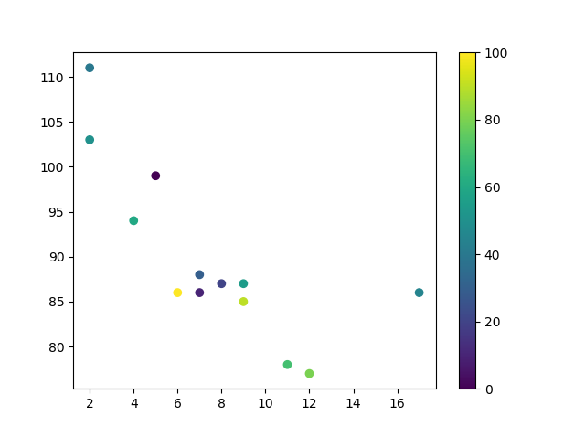
You can include the colormap in the drawing by including the plt.colorbar() statement:
Example
  import matplotlib.pyplot as plt
import numpy as np

x = np.array([5,7,8,7,2,17,2,9,4,11,12,9,6])
  y = np.array([99,86,87,88,111,86,103,87,94,78,77,85,86])
colors = np.array([0,
  10, 20, 30, 40, 45, 50, 55, 60, 70, 80, 90, 100])

plt.scatter(x, y, c=colors, cmap='viridis')

plt.colorbar()

plt.show()
Available ColorMaps
You can choose any of the built-in colormaps:
| Name | Reverse | |||
|---|---|---|---|---|
| Accent | Accent_r | |||
| Blues | Blues_r | |||
| BrBG | BrBG_r | |||
| BuGn | BuGn_r | |||
| BuPu | BuPu_r | |||
| CMRmap | CMRmap_r | |||
| Dark2 | Dark2_r | |||
| GnBu | GnBu_r | |||
| Greens | Greens_r | |||
| Greys | Greys_r | |||
| OrRd | OrRd_r | |||
| Oranges | Oranges_r | |||
| PRGn | PRGn_r | |||
| Paired | Paired_r | |||
| Pastel1 | Pastel1_r | |||
| Pastel2 | Pastel2_r | |||
| PiYG | PiYG_r | |||
| PuBu | PuBu_r | |||
| PuBuGn | PuBuGn_r | |||
| PuOr | PuOr_r | |||
| PuRd | PuRd_r | |||
| Purples | Purples_r | |||
| RdBu | RdBu_r | |||
| RdGy | RdGy_r | |||
| RdPu | RdPu_r | |||
| RdYlBu | RdYlBu_r | |||
| RdYlGn | RdYlGn_r | |||
| Reds | Reds_r | |||
| Set1 | Set1_r | |||
| Set2 | Set2_r | |||
| Set3 | Set3_r | |||
| Spectral | Spectral_r | |||
| Wistia | Wistia_r | |||
| YlGn | YlGn_r | |||
| YlGnBu | YlGnBu_r | |||
| YlOrBr | YlOrBr_r | |||
| YlOrRd | YlOrRd_r | |||
| afmhot | afmhot_r | |||
| autumn | autumn_r | |||
| binary | binary_r | |||
| bone | bone_r | |||
| brg | brg_r | |||
| bwr | bwr_r | |||
| cividis | cividis_r | |||
| cool | cool_r | |||
| coolwarm | coolwarm_r | |||
| copper | copper_r | |||
| cubehelix | cubehelix_r | |||
| flag | flag_r | |||
| gist_earth | gist_earth_r | |||
| gist_gray | gist_gray_r | |||
| gist_heat | gist_heat_r | |||
| gist_ncar | gist_ncar_r | |||
| gist_rainbow | gist_rainbow_r | |||
| gist_stern | gist_stern_r | |||
| gist_yarg | gist_yarg_r | |||
| gnuplot | gnuplot_r | |||
| gnuplot2 | gnuplot2_r | |||
| gray | gray_r | |||
| hot | hot_r | |||
| hsv | hsv_r | |||
| inferno | inferno_r | |||
| jet | jet_r | |||
| magma | magma_r | |||
| nipy_spectral | nipy_spectral_r | |||
| ocean | ocean_r | |||
| pink | pink_r | |||
| plasma | plasma_r | |||
| prism | prism_r | |||
| rainbow | rainbow_r | |||
| seismic | seismic_r | |||
| spring | spring_r | |||
| summer | summer_r | |||
| tab10 | tab10_r | |||
| tab20 | tab20_r | |||
| tab20b | tab20b_r | |||
| tab20c | tab20c_r | |||
| terrain | terrain_r | |||
| twilight | twilight_r | |||
| twilight_shifted | twilight_shifted_r | |||
| viridis | viridis_r | |||
| winter | winter_r |
Size
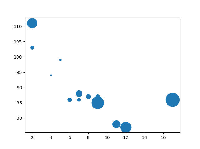
You can change the size of the dots with the s argument.
Just like colors, make sure the array for sizes has the same length as the arrays for the x- and y-axis:
Example
  import matplotlib.pyplot as plt
import numpy as np

x = np.array([5,7,8,7,2,17,2,9,4,11,12,9,6])
  y = np.array([99,86,87,88,111,86,103,87,94,78,77,85,86])
sizes =
  np.array([20,50,100,200,500,1000,60,90,10,300,600,800,75])

plt.scatter(x,
  y, s=sizes)

plt.show()
Alpha
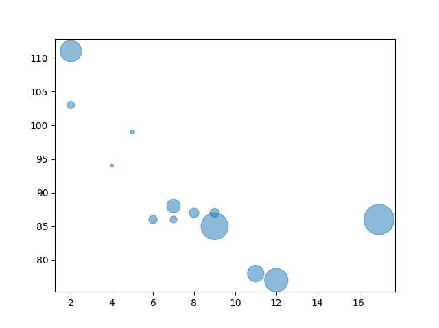
You can adjust the transparency of the dots with the alpha argument.
Just like colors, make sure the array for sizes has the same length as the arrays for the x- and y-axis:
Example
  import matplotlib.pyplot as plt
import numpy as np

x = np.array([5,7,8,7,2,17,2,9,4,11,12,9,6])
  y = np.array([99,86,87,88,111,86,103,87,94,78,77,85,86])
sizes =
  np.array([20,50,100,200,500,1000,60,90,10,300,600,800,75])

plt.scatter(x,
  y, s=sizes, alpha=0.5)

plt.show()
Combine Color Size and Alpha
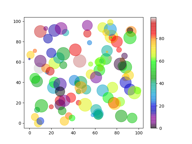
You can combine a colormap with different sizes of the dots. This is best visualized if the dots are transparent:
Example
  import matplotlib.pyplot as plt
import numpy as np

x =
  np.random.randint(100, size=(100))
y = np.random.randint(100, size=(100))
  colors = np.random.randint(100, size=(100))
sizes = 10 * np.random.randint(100,
  size=(100))

plt.scatter(x, y, c=colors, s=sizes, alpha=0.5, cmap='nipy_spectral')

plt.colorbar()

plt.show()