Creating Pie Charts
With Pyplot, you can use the pie() function to draw pie charts:
Example
import matplotlib.pyplot as plt
import numpy as np

y = np.array([35,
25, 25, 15])

plt.pie(y)
plt.show()
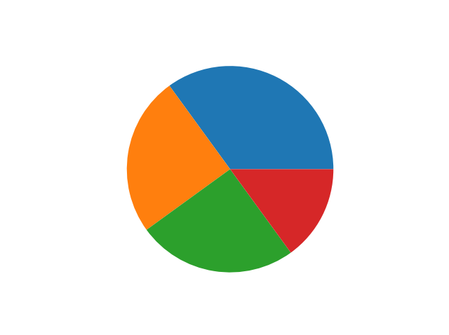
As you can see the pie chart draws one piece (called a wedge) for each value in the array (in this case [35, 25, 25, 15]).
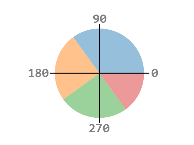
By default the plotting of the first wedge starts from the x-axis and moves counterclockwise:
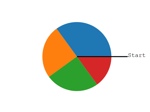
Note: The size of each wedge is determined by comparing the value with all the other values, by using this formula: The value divided by the sum of all values:
x/sum(x)
Labels
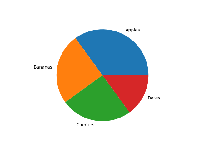
Add labels to the pie chart with the labels parameter.
The labels parameter must be an array with one label for each wedge:
Example
import matplotlib.pyplot as plt
import numpy as np

y = np.array([35,
25, 25, 15])
mylabels = ["Apples", "Bananas", "Cherries", "Dates"]

plt.pie(y,
labels = mylabels)
plt.show()
Start Angle
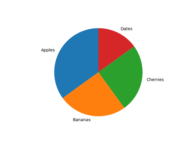
As mentioned the default start angle is at the x-axis, but you can change the start angle by specifying a startangle parameter.
The startangle parameter is defined with an angle in degrees, default angle is 0:
Example
import matplotlib.pyplot as plt
import numpy as np

y = np.array([35,
25, 25, 15])
mylabels = ["Apples", "Bananas", "Cherries", "Dates"]

plt.pie(y,
labels = mylabels, startangle = 90)
plt.show()
Explode
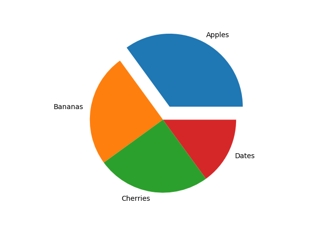
Maybe you want one of the wedges to stand out? The explode parameter allows you to do that.
The explode parameter, if specified, and not None, must be an array with one value for each wedge.
Each value represents how far from the center each wedge is displayed:
Example
import matplotlib.pyplot as plt
import numpy as np

y = np.array([35,
25, 25, 15])
mylabels = ["Apples", "Bananas", "Cherries", "Dates"]
myexplode = [0.2, 0, 0, 0]

plt.pie(y,
labels = mylabels, explode = myexplode)
plt.show()
Shadow
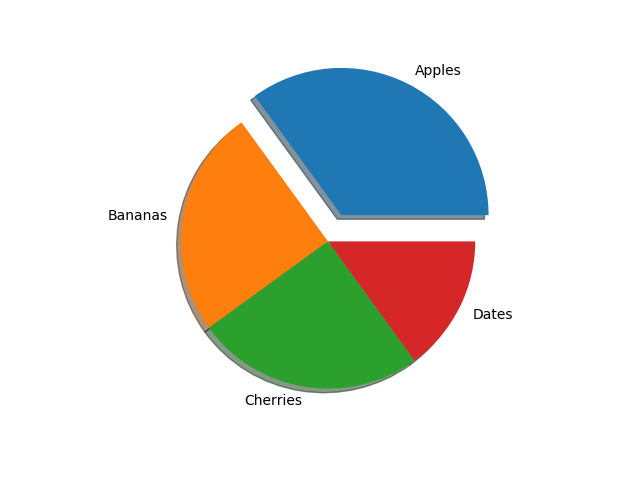
Add a shadow to the pie chart by setting the shadows parameter to True:
Example
import matplotlib.pyplot as plt
import numpy as np

y = np.array([35,
25, 25, 15])
mylabels = ["Apples", "Bananas", "Cherries", "Dates"]
myexplode = [0.2, 0, 0, 0]

plt.pie(y,
labels = mylabels, explode = myexplode, shadow = True)
plt.show()
Colors
You can set the color of each wedge with the colors parameter.
The colors parameter, if specified, must be an array with one value for each wedge:
Example
import matplotlib.pyplot as plt
import numpy as np

y = np.array([35,
25, 25, 15])
mylabels = ["Apples", "Bananas", "Cherries", "Dates"]
mycolors = ["black", "hotpink", "b", "#4CAF50"]

plt.pie(y, labels =
mylabels, colors = mycolors)
plt.show()
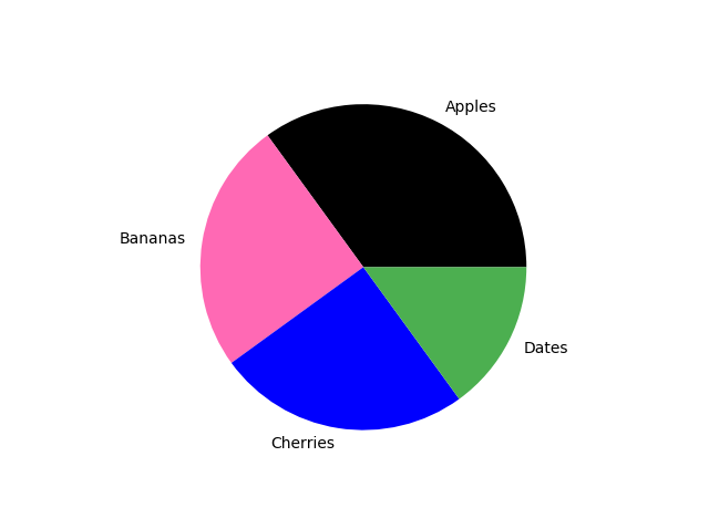
You can use Hexadecimal color values, any of the 140 supported color names, or one of these shortcuts:
'r' - Red 'g' - Green 'b' - Blue 'c' - Cyan 'm' - Magenta 'y' - Yellow 'k' - Black 'w' - White
Legend
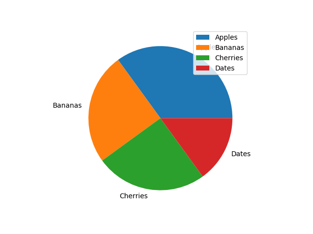
To add a list of explanation for each wedge, use the legend() function:
Example
import matplotlib.pyplot as plt
import numpy as np

y = np.array([35,
25, 25, 15])
mylabels = ["Apples", "Bananas", "Cherries", "Dates"]

plt.pie(y, labels = mylabels)
plt.legend()
plt.show()
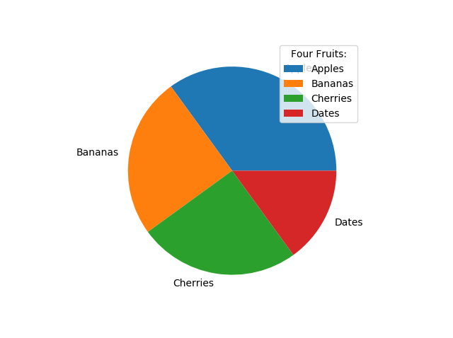
Legend With Header
To add a header to the legend, add the title parameter to the legend function.
Example
import matplotlib.pyplot as plt
import numpy as np

y = np.array([35,
25, 25, 15])
mylabels = ["Apples", "Bananas", "Cherries", "Dates"]

plt.pie(y, labels = mylabels)
plt.legend(title = "Four Fruits:")
plt.show()